Currently at Unite Us. Previously at Tonchin NYC.

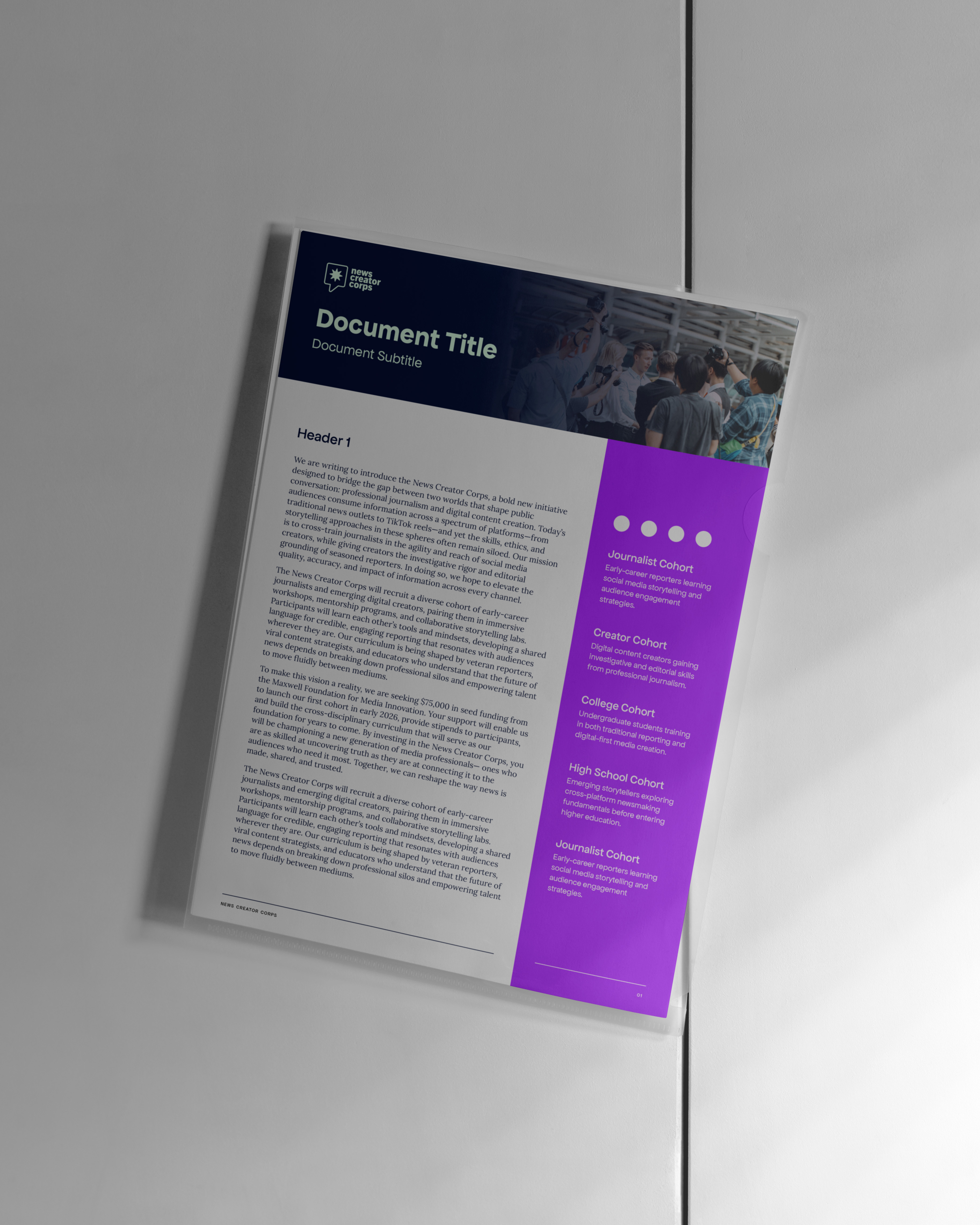
News Creator Corps was built specifically to NOT be a journalism company. Or at least not journalism as it used to be. It's been well documented that trust in legacy media is at an all-time low while most people my age get their current events from social media influencers and creators. The idea behind the startup was simple: train journalists on the tactics that make creators so trusted and watchable, and train creators with the journalistic tools they need to ensure ethical, balanced reporting.
The NCC team approached me with the design challenge of balancing the brand between the playful irreverence of a social media presence and the trust that comes from older media institutions. Any good graphic designer has to be a voracious consumer of news, trends, and modern tendencies, so I was particularly excited to help the team build a brand identity that'll allow them to work on one of the biggest issues in our communications landscape: trust.
Outside of the standard logo work, type suite, color suite, and brand manual, I also created a series of templates for the team's print and digital use cases ahead of their pilot media training fellowship.
Jesse Lorencz (Design Lead)
Ally Pratt (Associate Creative Director)
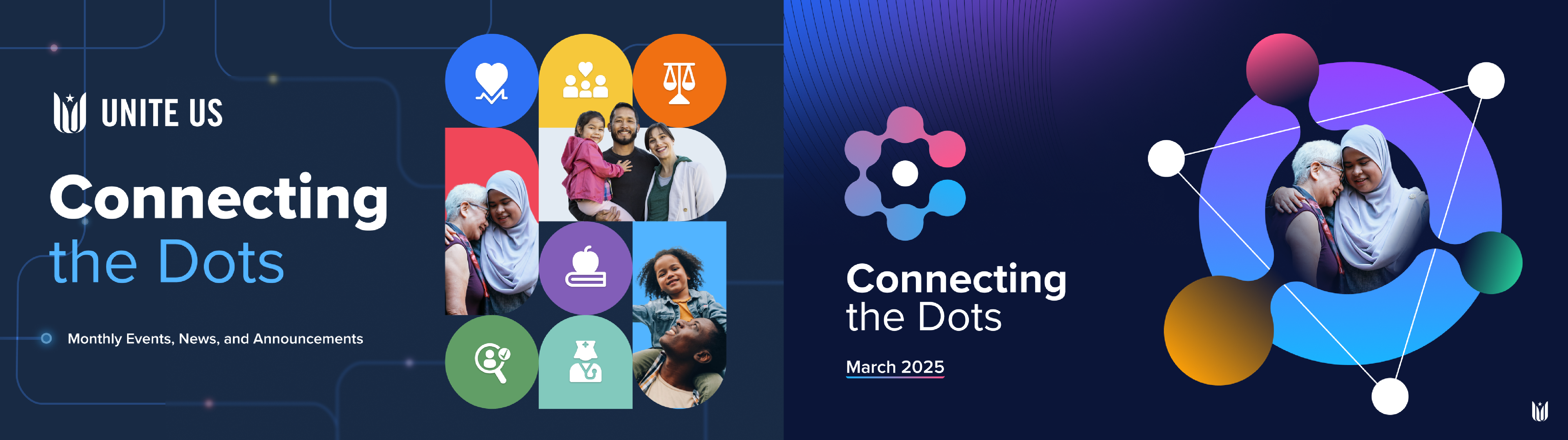
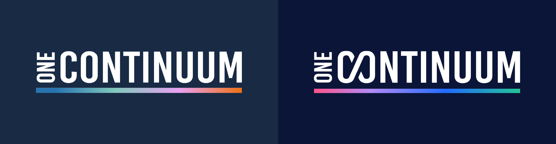
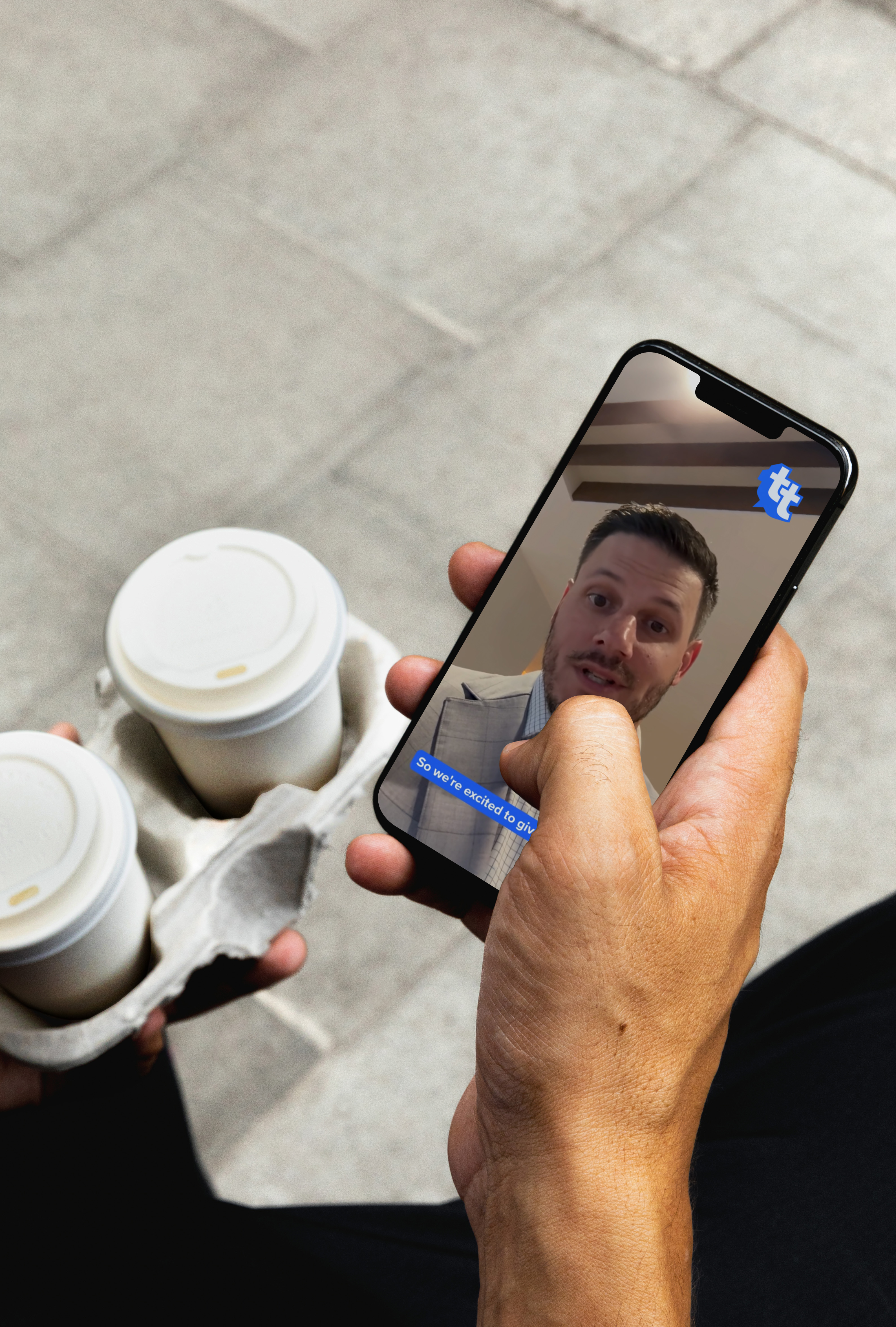
I joined Unite Us in August 2024 and provided visual, print, and digital materials to the marketing & brand teams. This included conceptualizing and creating sub-brand logos, event branding, associated signage, slide deck designs, webpage designs, and special event items like our annual holiday card. I worked with Design Lead Jesse Lorencz and Associate Creative Director Ally Pratt on all projects seen here, though none could have existed without the broad support of the Unite Us marketing team.
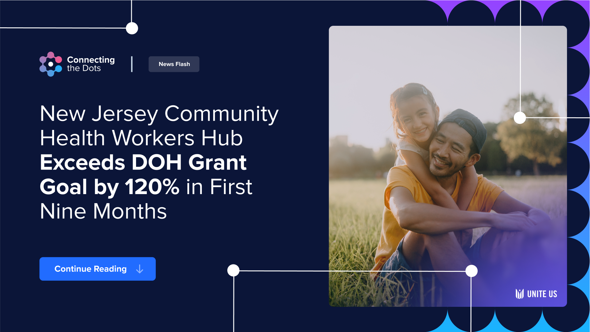
Connecting the Dots monthly newsletter branding
One Continuum annual conference branding


Taylor Talks CEO speaker series

2024 holiday card


Naoko Tanaka (photography),
Liam Winn (photography)
NYIFC is many things- chiefly a team, a community, and a set of principles. The local football (soccer) club play in the Cosmopolitan League of New York, by some measure the oldest league in the country. Many of the teams which play in this league have been around for decades. In fact, Hoboken FC, a rival club in the Cosmo League's first division, just celebrated its 113th birthday this year.
Unlike its peers, NYIFC is a brand new club, one that dates back only 5 years. Those 5 years have seen massive growth, with the team moving from the fourth division to the first in that time. From a branding perspective, the club (while short on history) is rich with context and tradition. As the club continues to scale, the black and gold Lions of New York are in urgent need of a design update.
It was crucial to the club's board that the design history of the previous badge be respected and maintained. As well as that badge had served, it was bumping up against the limits of its versatility due to problems around design complexity. It couldn't be embroidered. It was difficult to use with social media. My refresh of the brand focused on bringing forward the essential values of New York International while adding supplemental elements to allow for a more flexible toolkit of creative possibility. This included a redrawn pair of lions, a new typographic approach, additional colors, and a collection of social media templates for quick use by any member of the core team.


Kaede Yamada (project management),
Sandy Ha (brand management)
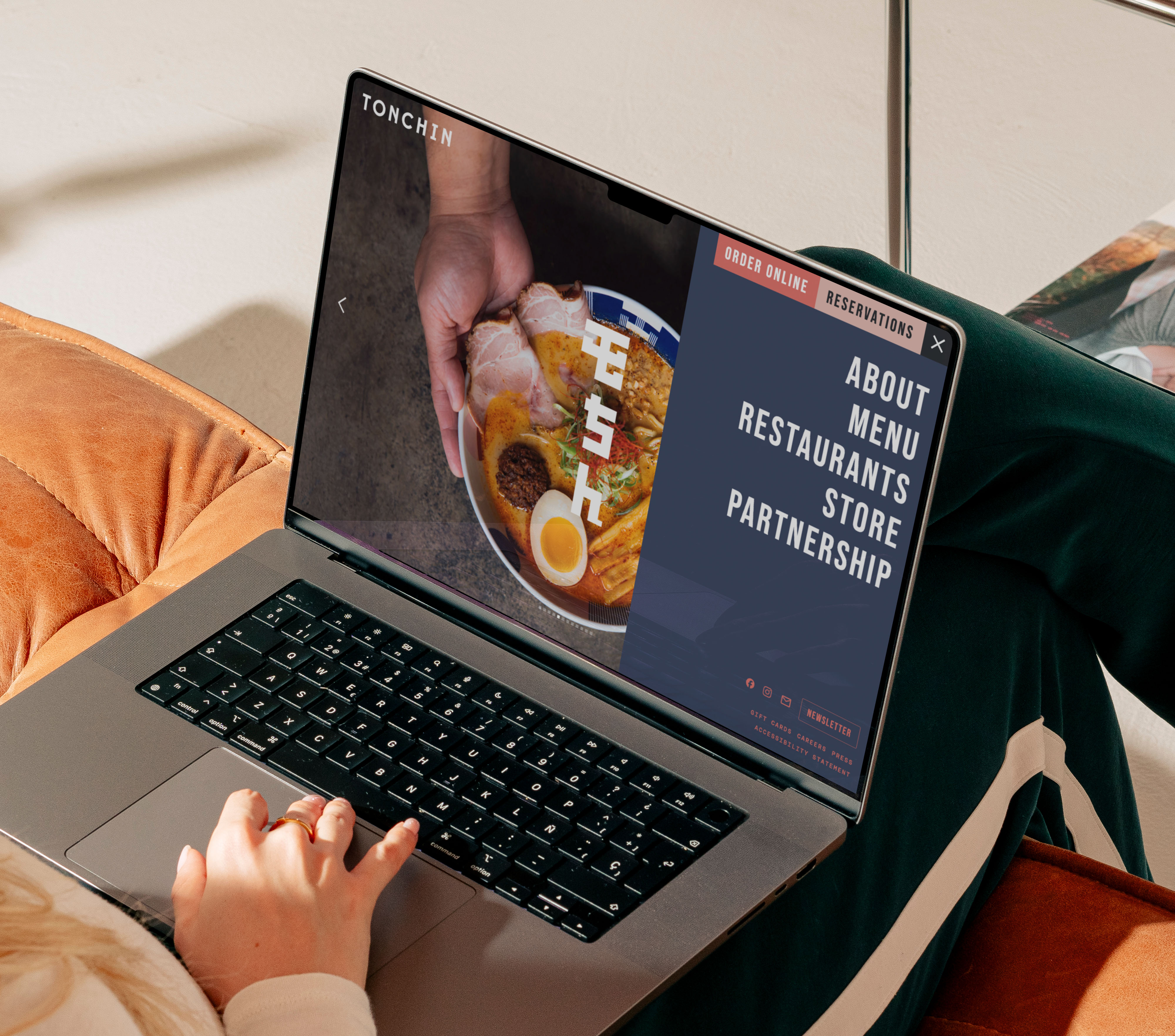
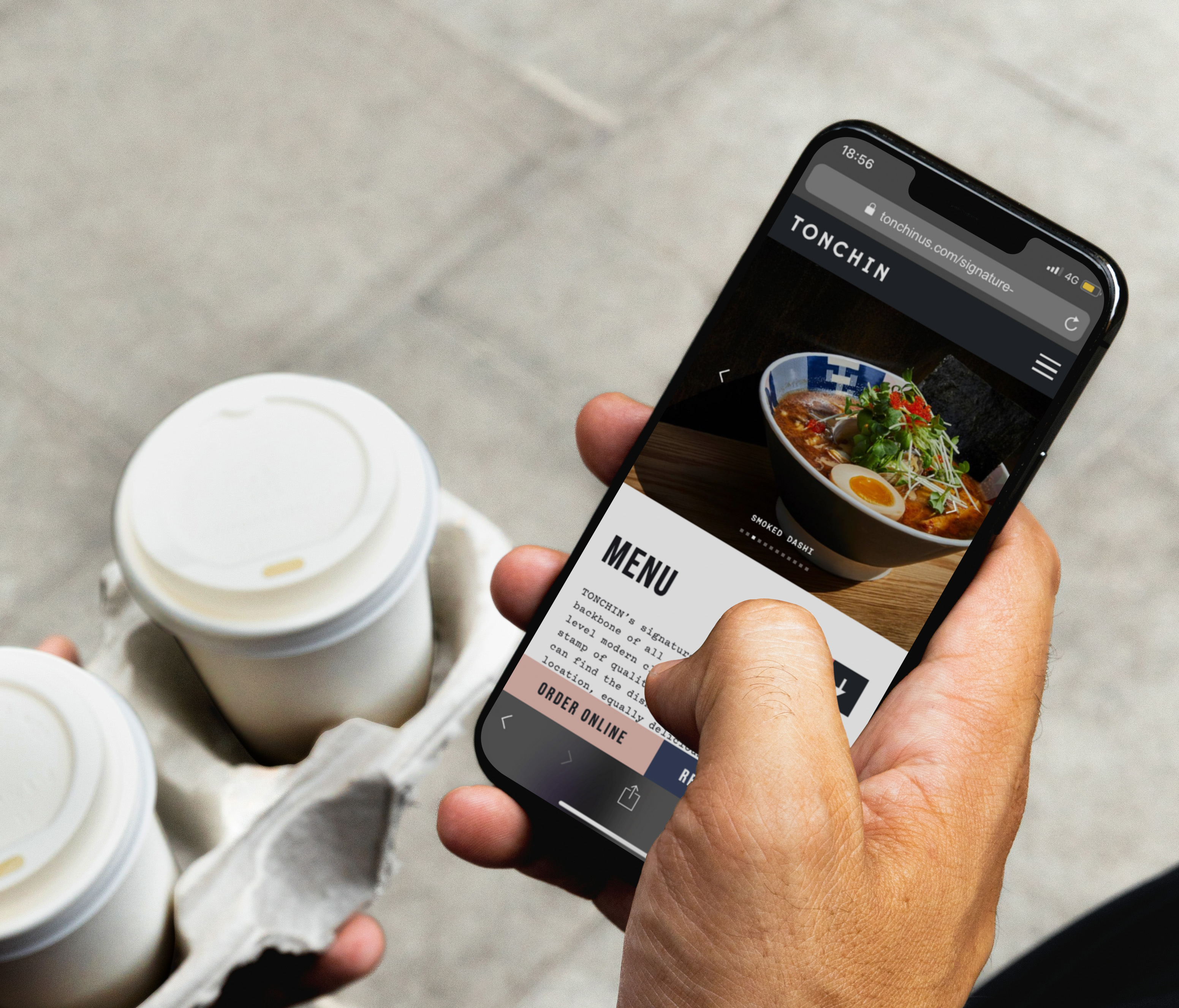
As a designer who had once worked at Tonchin as a server, I was perfectly primed to know the failure points of existing menus and merch—I was my own AB testing. We began by revisiting the website (tonchinus.com), optimizing it for quick, efficient customer interactions while also cleaning up the design. With the menus, I streamlined their content, adding helpful icons and illustrations to convey drink portion size to guests. Space was left for customer—server interaction by answering the most crucial menu questions (ingredients, allergies) while leaving some mystery (what exactly IS maguro, what is the sake of the day?) for Front of House workers to spin their hospitable charm.
The merch options seen here were entirely conceptualized by me, mostly in response to customer inquiry and my own instincts in translating Tonchin's unique visual and physical identity into design work. In the hoodie design, you'll see the physical placesetting of the restaurant (the chopsticks, bowls, and napkins) converted into a ramen mandala, a meditation on Tonchin itself.


Angel Anzures (illustration),
Ashley Randall (photography),
Tappei Sawasaki (photography),
Kana Motojima (photography),
Kaede Yamada (translation),
Yuto Watanabe (translation),
Mika Nishimura (translation),
Anne Pesquié (translation)
Presented in English, Japanese, Spanish, & French, A Place To Gather was created as a holiday gift for Tonchin's workers. The publication features 4 in-depth interviews with Tonchin employees, all of whom have contributed meaningful things to Tonchin's food, culture, and atmosphere. Presented in English, Japanese, Spanish, & French, A Place To Gather was created as a holiday gift for Tonchin's workers. The publication features 4 in-depth interviews with Tonchin employees, all of whom have contributed meaningful things to Tonchin's food, culture, and atmosphere.


Fullkit (creative direction, production)
Marty Tannenbaum (photography)
Blending football with fashion has been a popular move in the last few years. No one is doing it like Brooklyn studio Fullkit, who were some of the first to bring the iconic silhouettes and elements of soccer jerseys to the music world. I worked closely with their creative team on two jerseys for two very different artists.
The longsleeve shirt for experimental electronic music producer Oneohtrix Point Never was an exercise in restraint. Apart from the retro—tech badge design, the jersey features nothing but the bold letters OPN and the cream, orange, and teal found across OPN's recently released album, AGAIN. I contributed the badge design while the Fullkit team handled placement, color, and fabrication.
The jersey for Mary Jane Dunphe, a musician and poet with a more synthy pop sound, leans into the 90s with its argyle patterning, formal collar, and monogrammatic badge design. The photography by Marty Tannenbaum leans into the humid, blurry warmth behind the artist's music. I designed the badge and assisted with the overall design alongside the team.
More to come!


Avantika Velho (biodesign co-lead),
Manini Banerjee (biodesign co-lead),
Katia Zolotovsky (advisor)
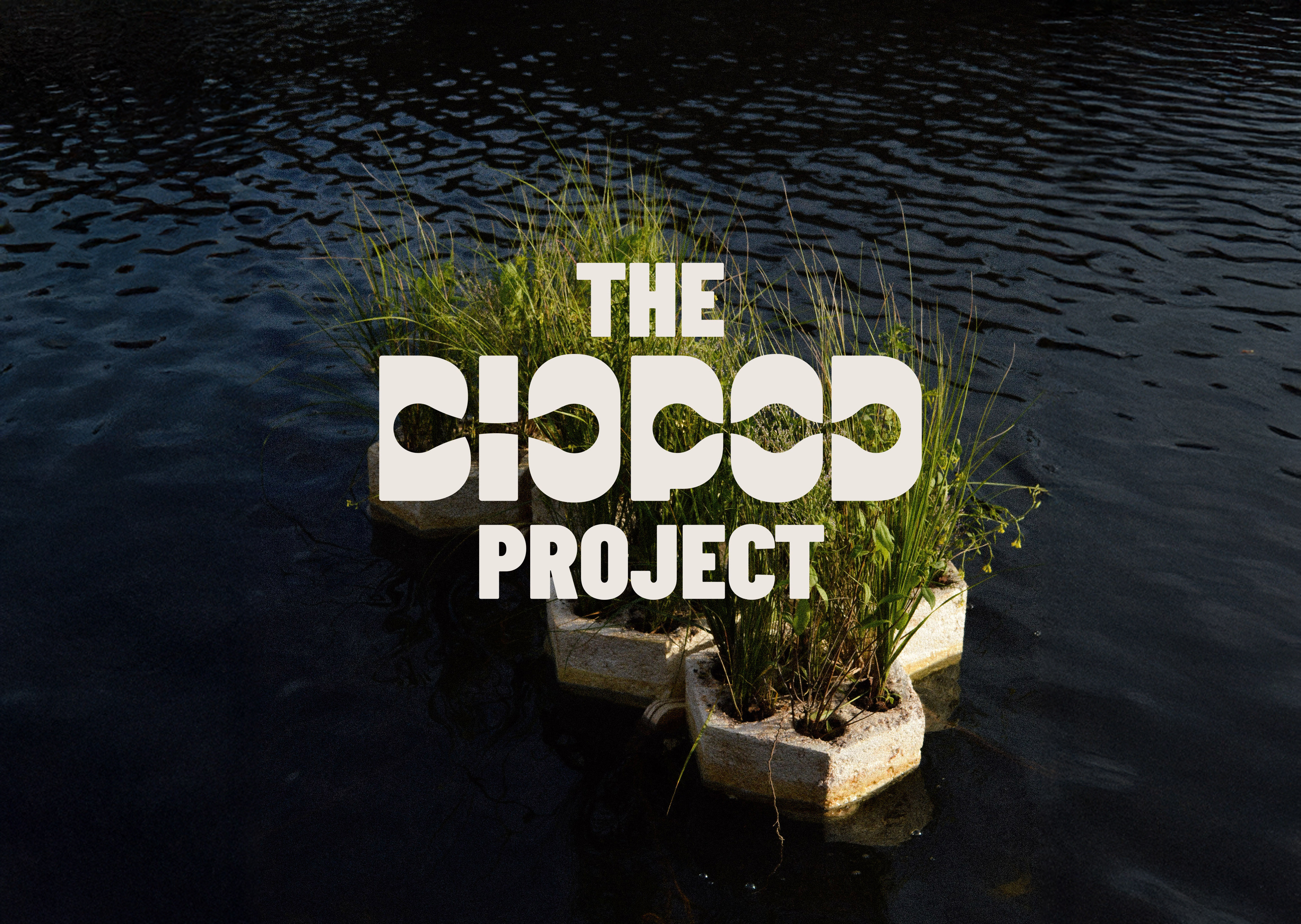
In short, Biopods are human—scale, modular, floating wetlands, developed by my team as part of our work supported by the RISD Somerson Sustainability Innovation Fund. Built from mycelium mushroom and local wetland plant life, the Biopods purify water through bioremediation: the use of naturally occurring ecologies to depollute a given site. In other words, they allow the plants to take in polluted water through their roots, filter it through their natural life cycles, and deposit healthy water back into the river over time.
The goal was to creative a flexible, organic, scalable identity system for the project as we moved into the planning of public—facing events with the city of Providence.


These title cards, created for the film ARJUN by Siddharth Thuppil, are laid out in both English and Sanskrit. The Bhagavad Gita, part of one of the most famous pieces of human literature ever written, is itself originally written in Sanskrit. I was tasked with creating Devanagari typography which could serve as beautiful, architectural design elements on each chapter card while also remaining legible to those who can read Sanskrit. I am not among the people who can read Sanskrit, but my mom is. Over a few cups of coffee, we sat down and ironed out which elements of each Devanagari character could be modified, and which elements needed to remain consistent. Using the English blackletter typeface Aktura as the point of reference, I hand—drew the title cards you can see below, refined for legibility but compromising nothing on elegance.


Football (soccer) is a spectator sport. As in, it’s a sport often played by people who are a lot better at spectating than playing. To capture the middle ground collegiate club soccer teams inhabit between the resources of varsity soccer and the nonchalance of intramural games, I styled the team on a well-worn, dorm-worthy couch placed on the sideline of a field. Taking in all the atmosphere with the sense of comfort and familiarity you only get from being at home— that's college soccer. The kit design itself was a nod to 90s two-tone kits, with the color scheme offering a slightly more modern take on Brown University's historic... well... brown.


Aaron Vanek (lead organizer),
Ayin Villagra-Brown (lead organizer)
Companies like Vital thrive off the labor of their many frontline workers. During my time at the Vital Climbing Gym in Williamsburg, we found that Vital management was not responding to the pressing questions employees had around wages, safety, and insurance. In the interest of developing new industry norms for the nascent climbing gym economy and the betterment of our workplace, we decided to pursue unionization. My role was focused on all external matters— communication with gym members, media, and local politicians. The strength of graphic design lies in its core as a medium of presentation, and this rebrand was conducted to bring the identity of our union in line with its historical roots and future outcomes.


Siddharth Gandhi (photography),
Annie Ren (illustration),
Jack Zhou (illustration)
Football (soccer) is the world's game. That includes art school. Despite the fact that sports and art are often framed as antithetical, there's tons of overlap between creatives and athletes. As a member of both of those identities, I wanted to design a jersey which could exist as a bridge between my passion for football and my community at RISD. This was my first time designing a garment for production, which had a huge, COVID-shaped learning curve.
Determined to finish before graduating, I taught myself the soft—goods CAD program CLO3D, formed a workable tech pack, established a factory connection in Hong Kong, and got the job done just in time for graduation week. I paired the jersey with a jacquard-woven scarf, a pair of character posters done in tandem with RISD Illustration classmates, and a refreshed club badge for future generations of RISD Midnighters to enjoy.